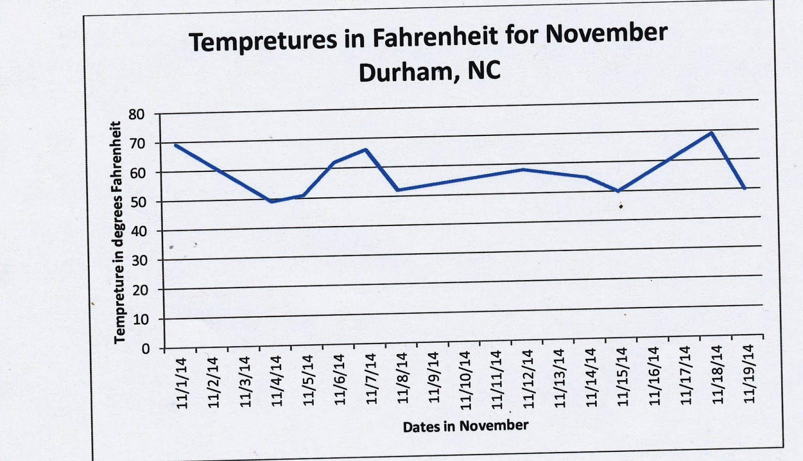
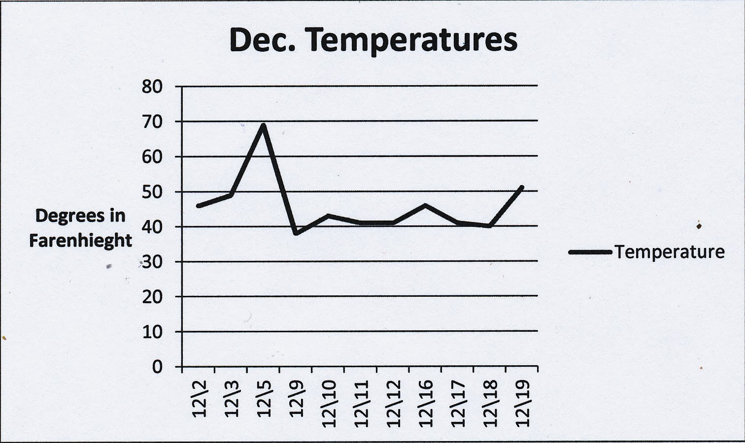
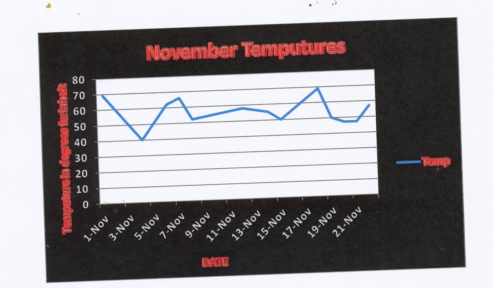
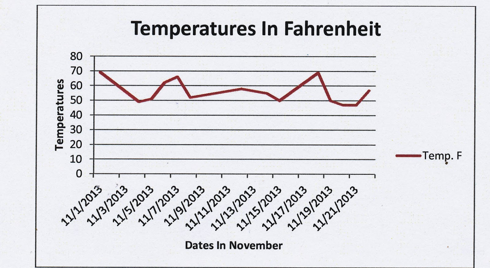
Students in Mrs. Roach's 5th grade class visited the Media Center this month to learn how to create graphs using Microsoft Excel. The students charted weather data for several months and were asked to create line graphs to show temperature changes in the months of November and December.
First Mrs. Husketh taught them how to enter data into Microsoft Excel and then she taught them how to create different kinds of graphs from that data. Each graph had to be labeled appropriately. We discovered that working with data can be frustrating because technical details are so important... but we also learned that working with data can be fun! It is much easier to see the changes in data when viewed as a visual graph versus written in a column in our notebooks. Also, we learned that certain types of data lend themselves to particular graphs (line vs. pie vs. bar).
Check out a few of the finished graphs below!
 |
| Sophie |
 |
| Caleb |
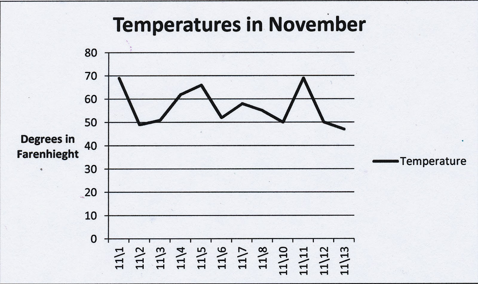 |
| Caleb |
 |
| Ben |
 |
| Julia |


